Great Northern Garlic Logo Redesign
Great Northern Garlic needed a new brand identity.
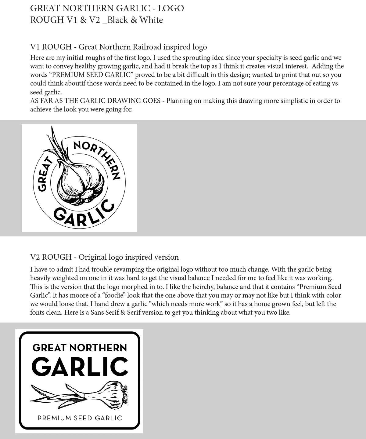
For the branding update, we started with two logo examples; one that was circular, and one that was a newer version of the previous logo. After analysis and conversation, we were set on shape and version. Next, we moved on to font and color choices that fit the vision and purpose of the product. You can see examples below of how we got to the final logo and branding choices. After the details were finalized one color black and white versions of the logo were created to complete the business assets.

Original Logo

Ideation

Rough Draft/Communication/Refinement


